No matter how attractively designed your ecommerce website is and how good your products are, if your site doesn’t convert well – you’re doomed if you don’t optimize it.
What is ecommerce conversion rate optimization (CRO)?
Conversion in ecommerce means a desired action taken by a visitor to your website. The term “conversion” has become synonymous with “sale,” but it’s bigger than that.
Conversion includes all the website footprints your visitors leave on their way to make a purchase at your online store. They can be micro-conversions or macro-conversions.
Micro-conversions are the small wins. They are the actions your website visitors take in the right direction. These wins may include liking and commenting on your blog, using your Shopify Quiz app, signing up for your email newsletter, making a site search for products, and adding an item to a wishlist.
Macro-conversions are the big wins. They are the actions your website visitors take that bring them closer to the end-goal of making a purchase. These wins may include adding products to the cart, initiating the checkout process, and completing a purchase.
Optimization in ecommerce is fine-tuning every aspect of your online store to create the best possible experience for your visitors, making it easier for them to make a purchase.
When your website visitors enjoy their experience with your store, whichever page they visit, or the functionality they use, they are more likely to trust and like your brand. This positive experience, in turn, makes it likely for them to make a purchase.
Ecommerce conversion rate optimization (CRO), therefore, is the process of increasing the percentage rate of visitors who take desired actions on your site. These actions can be both micro-conversions and macro-conversions.
CRO focuses on percentages, not volume. Instead of focusing on increasing website visitors to increase sales, you focus on improving the percentage of visitors who take key actions you want them to take. These actions can involve increasing your add-to-cart rates and lowering your cart abandonment rates to increase your conversion optimization rate.
Ecommerce conversion rate formula
The main CRO metric is conversion rate.
Regardless of the type of conversions you track, you use the same ecommerce conversion rate formula to track them by dividing the number of conversions for a specific period by the total number of visitors for that period, then multiplying the result by 100.
For example, if your website had 25 email signups and 200 visitors for a given month, your monthly email subscriber conversion rate would be 12.5% (25 divided by 200 = 0.125 multiplied by 100).
What is the conversion optimization process?

Conversion rate optimization basically involves analyzing user behavior and making strategic changes to improve website conversions.
There are five key elements of conversion rate optimization: data analysis, user experience (UX) design, user testing, content optimization and call-to-action (CTA) optimization.
Everything starts and proceeds with customer data. So, you must observe, ask, and engage with your customers.
Observe by using heatmaps and recordings to understand how customers navigate your site, uncover checkout flow issues, and make sure your customers see your CTA buttons.
Ask by using feedback forms and surveys. You can ask users how they found your site and why they’d recommend your product. You can also use exit-intent surveys to learn why your website users leave before making a purchase.
Engage through user interviews. Ask your users to understand what motivates them and what hinders them from proceeding further at your website. Improve your site design elements and sales copy based on this user feedback.
Essentially, you improve your conversion rate by understanding what drives, stops, and persuades your website visitors to take further actions so you can give them the best user experience (UX) possible.
As you learn about these user drivers, barriers, and hooks, you then update your website and product experience (PX) to help your visitors, so that you can ultimately increase sales.
17 Conversion Optimization Tips for Ecommerce Success
We’re providing a list here of the 17 key conversion optimization tips for ecommerce success by organizing them according to these key goals for conversion rate optimization:
- Increasing lead conversions
- Improving internal site search
- Boosting add-to-cart conversions
- Minimizing cart abandonment rates
Increasing lead conversions
Once a website visitor has given you their permission to contact them regularly by opting into your push notifications or providing their email address for your email newsletters, you’ve ended your lead generation phase with them. You have now entered the lead conversion phase with them.
Since they signified enough interest in your brand to let you contact them, they have turned from a general lead to a marketing-qualified lead (MLQ). It’s now your call to move them further along to becoming sales-qualified leads (SQL) to actual and repeat paying customers.
The best two ways to do this are through push notifications and email subscriptions.
Push notifications have 50% higher open rates and seven times higher click rates than emails. Still, email marketing is important as there are now 4.6 billion email users in the world, and email marketing can generate a return on investment of $40 for every dollar spent.
Here are the five key tips to increase lead conversion rate optimization.
1. Personalize.
Today, 90% of buyers in the United States find personalization so appealing that they’d even be willing to give up some personal privacy. The power of personalization is so strong that 72% of customers admit they only respond to personalized messaging.
Appeal to your customers’ values and provide that value with personalization. You need to know your customers and consider what would strongly resonate with them that they’d be willing to opt into your push notifications and give you their email address in return for more communication from you.
Clearly state your Unique Selling Proposition (USP) that matches their values and needs with your messaging and content strategies.
2. Show trustworthiness.
Along with personalization, it is impressing upon your website visitors that you are a trustworthy brand. Let them know about who you are, what your story is, and why you do what you do in the “About” section of your home page. Let your visitors know and feel that your ecommerce store is safe and secure with trust badges.
Spell-check your copy. Wrong spelling and typographical errors in your web copy convey sloppiness, unprofessionalism, and untrustworthiness. A website visitor may think: if you can’t even take care of your spelling, how can you ever take care of their needs?
Display your phone number prominently. Use social proof such as quotes from customer reviews and testimonials. Answer queries promptly. Use live chat software and AI chatbots if you have more queries than your team can handle. Add Instagram feed to website to showcase real-time updates and engage visitors. Convey a friendly and respectful tone all throughout your different forms of messaging.
Attend to your website design and usability to convey trustworthiness. Start with a professional logo, a consistent color scheme, a clear layout, and a fast loading speed. If you need help creating a logo, a logo generator can be a quick and easy solution. Further, tweak your site with a responsive design and user-friendly interface. These help create a positive first impression, enhance your brand image, and improve user experience.
Your visitors must perceive your brand as trustworthy. They must also see you as offering them more value than the cost of giving up a little of their privacy by letting you into their world. Trust signals significantly influence conversion.
3. Incentivize conversions.
Make it “cost-free” for your visitors to opt in and sign up. Provide free offers and discounts. Provide a free loyalty or membership program they can sign up for for continued and exclusive first-look offers and savings.
The design, placement, and copy of your CTA buttons affect opt-ins and email signups.
Use a high-color-contrast button with appropriate power words such as “free” and “save.” Place yo r CTA buttons in different spots. The most effective locations for opt-in and email sign-up CTAs are in the landing, product, checkout, and blog pages.
A warning, though: in your excitement to capture opt-ins and/or emails, avoid using capture pop-ups as soon as any of your website pages load. Visitors haven’t had a chance to experience and engage with your website and offers yet. Why would they already trust you with their opt-in permission and/or emails?
Study your visitors’ average page session time, then trigger your popup to appear about 50% of the way through the average session time. Monitor your conversions from this and keep tweaking until you get the conversion rate that satisfies you.
Use heatmap software to track users’ actions. If users are missing the CTA button or are not scrolling to the CTA button, find out why and make changes to improve the user interface (UI).
4. Nurture leads.
Often, it takes more than one interaction with your ecommerce store to convert a new general lead into a marketing-qualified lead (MLQ). This means you must nurture your leads.
Having them opt into your push notifications and/or sign up for your emails is a huge opportunity for lead nurturing.
Lead nurturing is the process of building relationships with your leads and continuing to grow those relationships throughout their entire customer journey with your brand. This makes your leads know and feel that you are not just out to make a fast buck off them but really care about them.
Strong lead nurturing campaigns can generate up to 50% more sales-qualified lead (SQL) conversions at a 33% lower cost per lead.
Today, you don’t even have to manually manage those leads anymore. You can take advantage of lead management software to automate key outreach points while integrating personalized touches so your leads keep coming back for more.
Lead nurturing basically involves purposefully engaging your target audience by offering them relevant information, supporting them in any way they need, and creating and maintaining a sense of delight throughout every stage of their customer journey with your brand.
Push notifications and email marketing are effective ways to do this.
5. Optimize your site.
Finetune how your website visitors experience your brand when they visit your site.
Grab visitors’ attention quickly with high-quality images and videos, especially on the product pages. Since online shoppers can’t physically see nor touch your products, you must provide them with ways to experience this virtually, so they can better visualize and get a feel of your products as they will use them in their lives.
Finetune your design elements. Use recording and/or heatmap software to find out how your visitors experience your site, then adjust according to what you discover.
For example, Andrew Ethan Zeng, a Shopify store owner, thought the banner at the top of his page would just be an attractive design element. However, using recording software, he found that any visitors to his page tried to click on the sales banner. So, he updated the banner to link directly to the sale, and conversions skyrocketed just from tweaking one design element.
Optimize your site for mobile devices. People often transfer from their mobile devices to their desktops to complete purchases because their mobile experience of certain sites is slow, unresponsive, and just plain dull. This could explain why ecommerce conversion rates for desktops are higher than for mobile.
Still, a huge part of ecommerce growth worldwide is driven by consumers using their mobile devices to shop. Mobile ecommerce sales reached $2.2 trillion in 2023, making up 60% of all ecommerce sales around the world. So, it’s important to optimize your online store for mobile devices.
Improving internal site search
Encourage users to use your website’s internal site search functionality so you can track their searches with web analytics tools and learn insights from their search behavior. It also significantly affects conversion rates.
Based on WebLinc research, internal searchers are 216% more likely to convert than regular users. What’s curious is that only 15% of companies have resources dedicated to optimizing their internal search, with half of the companies admitting that they have not assigned anyone responsible for keeping their website search functionality in optimum condition.
From the use of your internal search data, you can also find out what the most-searched items are on your site and how long they stayed on your site so you can increase your ecommerce conversion metric.
For example, if you find out that a green shirt is the most-searched item on your site, you may want to feature it as the most popular item on your homepage, so shoppers can get directly to it. This, then, increases the likelihood of their purchasing it.
Here are three more specific ways to improve your internal site search for conversion rate optimization.
6. Make sure your internal search bar is visible.
Most users on desktops expect to see ecommerce sites’ internal search bar on the upper middle or upper left of a page. Users on the mobile look for a magnifying glass icon to tap. Don’t place it too close to other boxes, such as sign-up fields, though, as this can confuse users.
Regardless of the device they’re on, users must see your internal search bar on all key pages – the home page, the category page, and the product pages.
This helps make their browsing easier while they’re still considering their options on the way to making a purchase.
7. Provide ideas for popular searches.
Make use of search engines powered by artificial intelligence (AI) showing users the most popular searches. Some users are not sure of what exactly they’re looking for.
Showing the most popular searches, usually on the right column of the page, like what Bath and Body Works does below, saves users time and enhances their positive experience with your site.
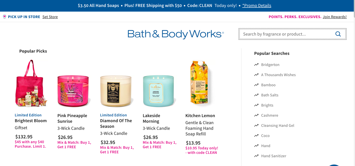
Also, make sure that your internal search can accommodate for synonyms and substitute terms. Most of the time, your visitors wouldn’t know the exact terms for your search queries, and they’ll type in whatever word or phrase comes to their minds.
Additionally, enable filtered navigation. With filters (such as price, color, size, brand, and ratings), visitors can refine their search down to a granular level. They are able to narrow down their options while they get closer to what they’re looking for. This helps your visitors sort through many search results with the least amount of time and effort.
8. Test your search bar and other website elements.
To see how your ecommerce site’s internal search function works, test it. Try using it yourself as if you were a visitor, especially a first-timer. Find out how easy or difficult it is to look for the items you want in the search bar, as well as in navigating your entire website.
Additionally, use recording software to check the placement of your search bar and see how your website visitors use it. Sweeping cursor movements indicate confusion, while rage clicks show frustration.
Rage clicks are when users keep on clicking on a certain area or a specific element of your site over a short period of time. They can be detected through in-person usability testing or with behavior analytics tools such as heatmaps and session recordings.
Rage clicks are often attributed to:
- Dead links
- Interactive elements that are broken
- Slow-loading pages
- Website bugs (JavaScript and other errors)
Identifying rage clicks and their causes gives you an opportunity to improve your online store’s user experience (UX) and increase your chances of conversion.
Boosting add-to-cart conversions
Add-to-cart is a key conversion metric in ecommerce. An online shopper needs to add items to their cart before they can check them out.
According to Kibo Commerce, the average add-to-cart rate in the United States is 11%. This means that for every 100 visitors to an ecommerce site, around 11 of them will add items to their carts.
However, not all visitors to your website will be able to promptly complete their purchase at that moment in time. So, tracking website events such as add-to-cart helps you gauge which products are getting the most consideration from your site visitors. This will then help you further finetune your online marketing strategies.
How do you nudge your website visitors to go from simply browsing your site to adding items to their carts? Here are six key tips for conversion rate optimization.
9. Use only high-quality images and videos.
Providing high-quality images and videos on your product pages can never be over-emphasized. Remember that for your website visitors, they are the next best thing to physically see and touch, and try them on for size and comfort. A detailed, 360-degree image or video of products helps potential customers visualize exactly what they are getting.
10. Structure your site logically for a seamless experience.
It is also important to structure your site in such a way that visitors can easily find the products they are looking for. You can do this by structuring your site in a logical manner, such as enabling visitors to “shop by product type” or “shop by color,” as Amazon does.
Remember that the faster a visitor finds the product they want, the more likely they are to buy from your site.
11. Provide detailed product descriptions.
Product details and specifications help users further visualize the product in their minds. When done right, product descriptions can convince and nudge users to add the described product items to their carts. Around 87% of consumers rate product content as an extremely or very important factor in their buying decision process.
Aim for product descriptions within the 200-word to 500-word range to do this, and to improve your online store’s search engine optimization (SEO) ranking. Adding a demonstration video also strengthens product descriptions.
Product descriptions don’t simply describe the product. They are also there to qualify, persuade, and surface the product.
Qualifying helps website visitors quickly assess whether the product is for them. Persuading provides compelling reasons for a potential customer to consider the product for purchase. Surfacing using SEO keywords and search terms in a natural way helps the product page show up in search engine results.
Powerful product descriptions have:
- Descriptive headlines that hook an audience in, often by connecting with them emotionally.
- Benefits-focused descriptions that explain why a consumer would benefit from it.
- A list of key benefits, including product features and details associated with the key benefits.
- Additional motivational details addressing potential purchase hurdles (such as social proof, product reviews, a tone of urgency, and a call to action).
12. Enable product reviews and product testimonials.
According to Spiegel Research Center, nearly 95% of shoppers read online reviews before deciding to buy a product. In addition, products with more than five reviews convert by 270% higher than those with no reviews.
Higher-priced product with reviews also convert higher at 380% than lower-priced products with reviews, which convert at 190%. This means that as the price of a product increases, the importance of reviews also increases.
You should put a system in place that automatically asks customers to review your products after they’ve had them for a reasonable period for them to make a valid review. The best time to ask them for a review is within 10 to 14 days, and not too soon. Asking them for reviews too soon would likely yield lower responses.
You can also “pre-sell” reviews by letting your customers know these three things immediately after they have completed their purchase:
- You want them to be 100% satisfied with their purchase.
- If they aren’t satisfied, you want to know why so you can correct their issue.
- If they are completely satisfied, you would appreciate an honest review.
Then, send them a link to an easy-to-accomplish review form. Essentially, you want them to answer the following questions and provide an overall rating for the product and your service:
- What was their situation before purchasing your product or service?
- What did the product or service do for them?
- What happened as a result of the purchase?
- What would they say to someone considering the product for purchase?
13. Make your “Add to Cart” and “Checkout” buttons prominent and prevalent.
When users are considering a purchase, they can be prompted along with prominent actionable buttons that say exactly what to do next.
These buttons should stand out from the rest of the page and must be strategically placed at those points where users will likely be in the product consideration phase of their buyer’s journey.
The best places to put these buttons are in areas where they are naturally and logically fit to be placed without appearing obnoxiously “sales”: under the product’s name, near the product’s price, and as a call-to-action (CTA) on a product’s description on a single product page.
14. Create urgency and desirability.
It’s a fact of human nature that we tend to value something more when we perceive it as scarce, and we tend to act to get something we desire when we know when have little time to get it.
This is the principle behind the marketing and sales strategy of creating urgency and desirability. It ignites the fear of missing out (FOMO) for most people. It can make potential customers feel like they need to act fast to get what they want.
Popular techniques for “scarcity marketing” involve:
- Heightening FOMO by highlighting the popularity of a product or service and its limited availability or exclusivity, “only for the first X people who act on it.”
- Using “limited time only” offers, promotions, discounts, coupons, or limiting the availability of a product or service within a certain period only, which makes them appear more desirable and valuable
- Using social proof, which plays to the need of most people for validation, which makes them feel safer and more affirmed in their purchase decision if many other people agree with it.
However, to be truly powerful and credible, creating a sense of urgency and desirability should be ethical and based on “realistic scarcity” so it doesn’t lead to mistrust and disappointment among potential customers.
It should be clear, transparent, communicate the benefits, and ideally used along with other strategies, such as using urgency to drive conversions while using social proof to increase trust.
Minimizing cart abandonment rates
An average of around seven out of every 10 customers leave ecommerce sites without completing their purchases. Every year, ecommerce stores around $18 billion in potential revenue from cart abandonment.
The top 15 industries topping the list of cart abandonment rates at higher than the 70% average rate are:
- Cruise and ferry, 98%
- Mobile providers, 90.76%
- Airline, 90%
- Luxury goods, 87.93%
- Fashion, 87.79%
- Automotive, 85.97%
- Baby and childcare, 84.86%
- Travel, 82%
- Car rental, 82%
- Hotel,80%
- Gardening and do-it-yourself (DIY), 79.23%
- Department stores, 76.63%
- Retail, 71.24%
- Sports and outdoor, 70.3%
- Cosmetics, 70.11%
According to a Baymard Institute survey, the top reasons for cart abandonment are:
- Extra costs (shipping, taxes, fees) are too high (48%).
- The site wanted the user to create an account (24%).
- Too slow delivery (22%).
- The user doesn’t trust the site with their credit card information (18%).
- Too long/complicated checkout process (17%).
- The user couldn’t see/calculate the total order cost (16%).
- The website had errors/crashed (13%).
- The site’s returns policy wasn’t satisfactory (12%).
- There weren’t enough payment methods (9%).
- The user’s credit card was declined (4%).
Obviously, to minimize cart abandonment rates, e-commerce sites must address these concerns, especially the top-cited ones.
Always show shopping cart contents.
Implement a browse abandonment campaign.
Here are four more key CRO tips for minimizing cart abandonment rates for your ecommerce site.
15. Use more effective fonts.
Few marketers pay attention to this, but the right fonts can boost conversion and minimize cart abandonment rates. Typography influences comprehension. They can draw a reader in, encourage them to stay longer on a page, and even nudge them towards making a purchase.
When choosing the right fonts for your brand, don’t use more than two different fonts. Also, consider cross-device legibility. Helvetica has been the most popular font in advertising since the 1950s for its simplicity and versatility.
Today, the top 20 best fonts for ecommerce websites are:
- Lato
- Montserrat
- Oswald
- Merriweather
- Playfair Display
- Rubik
- Raleway
- Roboto
- Cabin
- Lora
- Open Sans
- Rokkit
- Alegreya/ Alegria
- Berkshire Swash
- League Spartan
- Norwester
- Cormorant
- Dancing Script
- Bitter
16. Simplify the checkout process.
By simply improving checkout flow, online stores can increase conversion rates by 35.26%. So make your checkout process straightforward, short, and quick. Although there’s the 3-Click Rule in ecommerce, it has been debunked as arbitrary and not supported by valid research data.
The Nielsen Norman Group emphasizes that instead of focusing on the number of clicks, it is better to ensure that the overall site and especially checkout page navigation is well-organized, with clear pathways, that your content gets progressively more granular the deeper into the site structure your website visitors go, and that they always know where they are and how to get to their destination.
Simplifying the checkout process also includes:
- Enabling a guest checkout option
- Making it easy for users to edit their carts
- Showing checkout progress bars on the checkout page
- Auto-applying promotional and discount coupons
- Providing estimated shipping fees based on location, or better, providing free shipping
- Providing a running total order balance every time they add to their carts
- Providing multiple payment methods using different currencies for payment
- Enabling a live chat option for checkout support.
It’s important to remember not to tweak too many design elements all at once. When testing, it’s best to do it one element at a time. Otherwise, you would have confusing test results, which you’d find difficult to attribute to a particular change.
Also, too many page changes, updates, and optimizations all at once would frustrate your users. Small, incremental design changes are less likely to disrupt customer loyalty and brand recognition. This enables you to optimize your site without sacrificing your brand identity. When discussing these changes with your team members, ensure a cohesive presentation design to foster clarity and reinforce key points. To make this process smoother and more efficient, leveraging the best AI for presentations can help create a unified design approach while maintaining brand consistency.
However, if you’re doing a complete overhaul for rebranding, it’s a different story. Since you will basically transform your brand identity, the sudden, dramatic changes it will require will be understandable to users as long as you let them know in advance.
17. Follow-up shoppers who abandon their carts.
Integrate exit-intent pop-ups into your checkout page. Exit pop-ups are automated marketing tools where website visitors are shown compelling, often time-sensitive, offers when they show intent to leave the website, especially their carts without completing checkout.
Additionally, follow up with cart recovery emails one hour after cart abandonment. Studies have shown that this is the best time window with the highest conversion rate of 16%. Cart abandonment emails also have a higher open rate of 41.09% compared to the average email open rate of 16.97%.
You can also use push notifications to boost the chances of your reminder being promptly seen by the user. Subscriber’s Abandoned Cart feature deep-links to the cart at the exact point a user abandons it and promptly sends a friendly reminder with an incentive for the user to complete the purchase. You can sign up for a free Subscriber account here.
What is a Good Ecommerce Conversion Rate?
According to the latest data, the average ecommerce conversion rate worldwide is 3.76%. This is based on the monthly data recorded for the past 12 months, which varied from 3.32% to 4.55% over the February 2023 to January 2024 period.
The average conversion rate also varies by industry and business niche, depending on the need for their products in the daily lives of consumers and the product affordability. Here are the top 10 industries and niches with their average conversion rates:
- Food and beverage, 6.68%
- Beauty and personal care, 4.92%
- Multi-brand retail, 4.72%
- Consumer goods, 4.5%
- Health and wellbeing, 4.2%
- Arts and crafts, 4.07%
- Fashion, accessories, and apparel, 3.56%
- Pet care and veterinary services, 3.4%
- Home and furniture, 2.55%
- Luxury and jewelry, 1.33%
Ecommerce conversion rates also vary by user device. Desktops have the highest average conversion rates at 4.42%, followed by tablets at 4.13% and mobile at 3.32%.
By geographical region, ecommerce conversion rates worldwide show that among the Americas (North and South America), EMEA (Europe, Middle East, and Africa), and APAC (Asia-Pacific) regions, EMEA has the highest at 4.11%. APAC has the lowest at 2.76%, and the Americas are on middle ground at 3.56%.
By country, the United Kingdom has the highest ecommerce conversion rate, while Italy has the lowest among the top six countries surveyed:
- United Kingdom, 4.1%
- United States, 2.3%
- Germany, 2.22%
- Denmark, 1.8%
- Netherlands, 1.78%
- Italy, 0.99%
In general, business-to-consumer (B2C) businesses have higher ecommerce conversion rates than business-to-business (B2B) businesses, which have an average conversion rate of 2.1%. B2B customers purchase in higher volumes and tend to be more careful with their purchase decisions, considering that B2B products are also often more expensive.
Don’t Forget Your Customer

The key to conversion rate optimization (CRO) for ecommerce is optimizing each step in the customer journey so that you can create a positive customer experience (CX) for your users.
In implementing, testing, and tracking these various tips for ecommerce conversions and studying your users’ behavior around them, don’t lose sight of your customer. Your conversation rate optimization efforts begin and end with them.
Don’t overthink and obsess so much about tracking the numbers and tweaking the conversion rates that you lose sight of what really matters: your customers.
Although hard, quantitative data plays a significant role in your decision-making and strategy implementation; remember the people you’re trying to help. Consider also qualitative data by regularly asking them for feedback and concerns about their experience with your business. This shows them you truly care, and most would be honored to be asked. You can show Google reviews on your website to highlight positive experiences and build trust with potential customers.
